
Why Food Trucks Need a Mobile-Friendly Website
Why Food Trucks Need a Mobile-Friendly Website
Food trucks live and die by convenience. Customers find them while they are on the move, decide quickly where to eat, and often make choices based on what is nearby right now. That means a food truck website cannot behave like a traditional restaurant website built only for desktop users. It needs to work perfectly on phones, load fast, and make it easy for hungry people to find the menu, location, and ordering options in seconds.
A mobile-friendly website is no longer a nice extra for a food truck business. It is one of the most important tools for attracting customers, increasing sales, and building trust. If your website is hard to use on a phone, many people will leave before they ever see what you offer. In a business where decisions happen fast, that is a major loss.
Food Truck Customers Are Usually on Their Phones
The biggest reason food trucks need a mobile-friendly website is simple: your customers are on mobile devices. They may be:
- walking through a downtown area
- standing at an event or festival
- looking for lunch during a work break
- checking social media for where to eat next
- searching “food truck near me” on their phone
Unlike customers at home browsing a desktop computer, food truck customers are often hungry and making quick decisions. They do not want to pinch and zoom to read your menu or hunt through tiny links to find your location. They want answers immediately.
A mobile-first design meets this expectation. It puts the most important information front and center so people can act fast. For a food truck business, that often means more visits, more orders, and fewer missed opportunities.
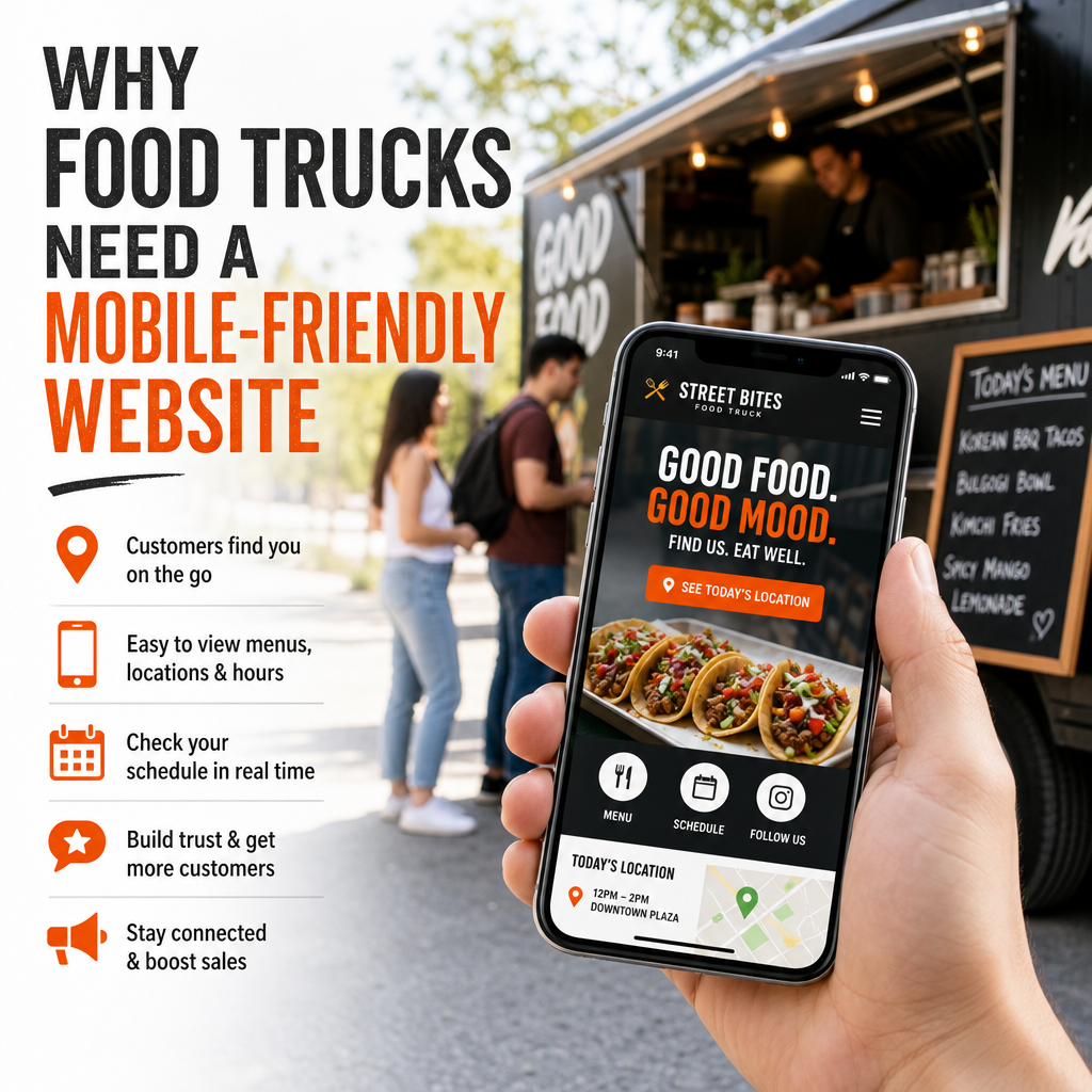
A Mobile-Friendly Website Makes It Easy to Find Your Food Truck
One of the most common questions customers ask is, “Where are you today?” If your food truck website does not make your location easy to find on a phone, you are making people work too hard.
A strong food truck website should include:
- today’s location
- weekly schedule
- upcoming events
- parking or setup details
- live updates if the truck moves
This information should be visible without excessive scrolling or confusing navigation. On a mobile-friendly website, a visitor can open the homepage and quickly see where you are, what time you are there, and what food you are serving.
Example
Imagine someone leaving work at 12:15 p.m. They search for lunch options nearby. Your site opens, but the location is hidden in a PDF or under several menu tabs. They may not have time to search, so they choose another business instead.
Now imagine the same person opening a mobile-friendly website with a large banner reading:
Today’s Location: 5th Street Market, 11 a.m. to 3 p.m.
Below that is a clear button for directions. That small improvement can make the difference between a sale and a lost customer.
Your Menu Needs to Be Easy to Read on a Phone
The food truck menu is one of the most important parts of your website. People visit your site because they want to know what you serve and how much it costs. If your menu is unreadable on a phone, you are creating frustration right where excitement should be building.
A mobile-friendly menu should:
- use clear text
- load quickly
- avoid tiny fonts
- be easy to scroll
- show prices clearly
- work well without downloading a file
Many food trucks make the mistake of uploading a PDF menu designed for print. While that may look fine on a desktop, PDFs are often difficult to read on mobile devices. Users may have to zoom in, swipe around, or wait for the file to load. That is not ideal for a small business website meant to win fast attention.
Better menu design for mobile
Instead of a PDF, consider a web page with:
- categories like tacos, burritos, drinks, and desserts
- short descriptions for each item
- clear pricing
- notes for dietary options such as vegetarian or gluten-free
- a featured items section for seasonal specials
This structure improves food truck web design and gives customers the confidence to place an order or visit your truck.
Mobile-Friendly Design Supports Online Ordering
Many food trucks now offer online ordering, pre-orders, or pickup scheduling. This is especially valuable during busy lunch rushes, festivals, or private events. If your website is not mobile-friendly, customers may abandon the ordering process before it is complete.
People expect online ordering to be simple. They want to:
- browse the menu
- choose items
- customize an order
- pay quickly
- receive confirmation
If any step feels confusing on a smartphone, the process breaks down. Mobile-friendly design helps remove friction and makes the ordering experience smooth.
Why this matters
A customer may be standing in line, trying to place an order while juggling work calls or managing a group of friends. If your site is slow, hard to tap, or does not fit their screen properly, they may decide to wait or skip ordering entirely.
A responsive, mobile-first design gives customers a better experience and helps your food truck business capture more revenue. The easier it is to order, the more likely people are to buy.
It Improves Food Truck Marketing
A mobile-friendly website is not just a place to list your menu. It is a marketing engine. Food truck marketing depends on visibility, convenience, and shareability. Since much of your audience discovers you through mobile devices, your website needs to support the rest of your online presence.
People often arrive at your site from:
- Google search
- Instagram bio links
- Facebook posts
- QR codes on signs or packaging
- event listings
- local business directories
These are all mobile-heavy traffic sources. If visitors click through from a social post and land on a site that is difficult to use on their phone, the marketing effort is wasted.
Mobile-friendly websites improve marketing results by:
- keeping visitors engaged longer
- increasing menu views
- boosting order conversions
- making it easy to share your site
- helping with local search visibility
Your website should be built to support the same fast-paced style of your food truck business. Since customers often discover and interact with your brand on mobile, your website has to match that behavior.
Mobile-Friendly Sites Help with Local SEO
Search engine optimization matters for food trucks, especially local search. When people search for phrases like “tacos near me” or “best food truck in [city],” Google looks for websites that are fast, useful, and mobile-friendly.
A mobile-friendly website can improve your visibility in search results because search engines prioritize pages that are easy to use on phones. If your site is not optimized, it may be pushed down in rankings, making it harder for new customers to find you.
Local SEO benefits of a mobile-friendly website
- better performance in “near me” searches
- more visibility on mobile maps and local listings
- improved click-through rates from search results
- stronger user engagement signals
For a food truck, local SEO is especially important because your business changes locations. A well-structured food truck website can help search engines understand where you operate, what food you serve, and when you are open.
A Mobile-Friendly Website Builds Trust
People are more likely to trust a business with a professional, easy-to-use website. If your site looks outdated, broken, or difficult to navigate on a phone, customers may assume your food truck business is less reliable than competitors.
This matters because food is personal. People want to know:
- Is the truck open today?
- Is the menu current?
- Are the prices accurate?
- Can I order easily?
- Is this a legitimate business?
A polished mobile-friendly website answers those concerns immediately. It shows that you care about customer experience and that your business is organized. That impression can be just as important as the food itself.
Small details that build trust
- updated hours
- current location information
- professional photos
- simple navigation
- clickable phone number
- map integration
- working buttons and links
These details may seem minor, but together they create a stronger brand and a better customer experience.
It Helps You Compete with Other Food Businesses
Food trucks compete not only with each other but also with restaurants, cafes, delivery apps, and fast-casual chains. A well-designed mobile-friendly website helps level the playing field.
Unlike a fixed-location restaurant website, a food truck website must communicate more urgency and flexibility. Customers need immediate answers, and your competitors are also trying to capture that same mobile attention. If their site is faster and easier to use, they may win the order even if your food is better.
What a stronger mobile experience can give you
- faster customer decisions
- more repeat visits
- better event turnout
- more online orders
- stronger brand recall
In a crowded market, small improvements in mobile usability can have a big impact. That is why food truck web design should not be treated as an afterthought.
Key Features Every Food Truck Website Should Have
If you are building or improving a food truck website, focus on the elements that matter most to customers on mobile devices.
1. Clear homepage content
Show your truck name, cuisine type, current location, and a strong call to action right away.
2. Mobile-friendly menu
Use readable text, clear pricing, and simple categories. Avoid hard-to-use PDFs.
3. Live schedule or location page
Make it easy to check where you will be today and later in the week.
4. Online ordering link
If you offer online ordering, place it prominently and make the process simple.
5. Tap-to-call and tap-to-map buttons
Let people contact you or get directions with one touch.
6. Fast-loading images
Use high-quality food photos, but optimize them so they do not slow the site down.
7. Social media integration
Many food truck customers follow updates on Instagram or Facebook, so make it easy to connect.
8. Contact and event booking information
If you cater private events, include a simple way for customers to inquire.
Common Mistakes Food Trucks Make with Websites
A lot of food truck businesses have websites, but not all of them are effective. Some common problems include:
- using a desktop-only layout
- hiding the menu in a PDF
- making the location hard to find
- using small buttons and text
- loading too slowly on mobile
- failing to update hours or schedule
- linking to broken ordering pages
These mistakes create friction and can cost you business every day. A mobile-first design solves many of them by focusing on the needs of real users instead of just the visual layout.
Why Mobile-First Design Is the Right Approach
Mobile-first design means building the website with smartphone users in mind from the start. For a food truck business, this approach makes sense because most of your traffic is likely to come from mobile devices.
Instead of designing for a desktop screen and then shrinking everything down, mobile-first design prioritizes:
- speed
- simplicity
- readability
- tap-friendly navigation
- essential information first
That approach helps ensure the website works well in the real-world situations your customers face. Whether they are in line, driving to your location, or scanning a QR code at an event, they can use the site with ease.
Conclusion
A mobile-friendly website is essential for any food truck business that wants to attract customers and grow. Since your audience is often searching on phones, your website must make it easy to find your location, read your menu, place an order, and trust your brand.
Strong food truck web design supports better food truck marketing, improves online ordering, and helps your business stand out in a busy local market. If your site is clear, fast, and mobile-first, it becomes one of your most valuable business tools.
For a food truck, convenience is everything. A mobile-friendly website delivers that convenience before customers ever take the first bite.